« Simplicity is the mother of all virtues », says an African proverb. How true! And the principle applies well when it comes to graphic design for vehicle lettering and wraps.
« Beauty lies in simplicity »
– Unknown author
THE CHALLENGE
When time comes to advertising a company or a product, one of the most effective ways to reach as many people as possible is to letter or wrap a vehicle. At this stage, many think more information will draw more potential customers to the business. But what do the facts say?
Advertising is not just a question of mathematics, but it is mainly a question of esthetics and memory. Here are some key concepts to keep in mind when lettering or wrapping a vehicle:
- The human eye recognizes shapes (words, names) rather than individual letters
- The amount of information one can decipher and remember is limited by the short exposure time
- The simpler a design is, the more appealing and easy to understand it becomes
EXAMPLES
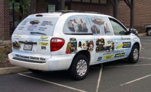
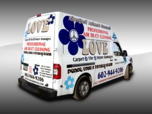
Before you look at the following images, imagine these vehicles driving by you at 50-70 km/h. You have only one second to decipher the message and remember the name of the business in question, the product or service offered and how to contact them.


Now you see what a bad design does. I feel I must point out that a bad design is not always cause by a bad designer: sometimes it’s the client who insists on putting everything on the vehicle: photos, descriptions, slogans, products, etc. Let’s keep these for a brochure or a printed document we can give our client when he or she comes thru the door.

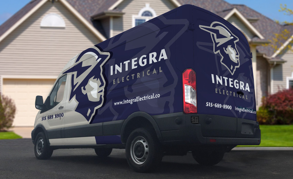
Now here is a perfect example of a simple design: logo, website, phone number. Potential clients understand right away what the company is offering, and in a fraction of a second they are drawn to the design and will remember the logo as well as the name of the business.
CONCLUSION
Three things to remember for a simple design :
- Limit the use of fancy or script fonts that are hard to read
- Limit the amount of information
- Use contrasting colours and oversized logos
We all have only a short amount of time to make a lasting impression clients will remember. With modern technology, it isn’t necessary nor suggested to write the address, postal code or fax number. The website, phone number and logo: this is what matters most!
Whether your budget for your vehicle lettering is 250$ or 4000$, design simplicity will make you stand out and draw attention from clients. This will make it a great investment!
