Customers and firms often ask us which colour format we use: CMYK or RGB?
CMYK
Typically, when a file is prepared for printing, many companies use the CMYK colour space. The reason is simple: originally, printers used a 4-colour process based on four inks : Cyan (C), Magenta (M), Yellow (Y) and Black (K for Key). The combination of these inks made it possible to obtain a range of colours, also called a colour gamut, specific to this process. This is called Subtractive Colour.
Subtractive Colour Model
Without any colour, a sheet of paper reflects all colours, which we see as white. By adding coloured inks (Cyan, Magenta and Yellow), these absorb or “subtract” part of the reflected light. Eventually, by combining all the colours to their maximum, most the wavelengths are absorbed and a colour close to black is what we see.
However, the combination of these three basic colours does not always result in a neutral deep black; to compensate for the tint and add opacity, black ink is used. This also allows darkening of any colour obtained by combining the other three, which increases the range of colours considerably.
Black also makes it possible to avoid excess ink saturation in printing: rather than having a 300% ink coverage (100% of each colour), there is only 100% of black ink coverage. Moreover, the black inks being less expensive, the process allowed a considerable saving; the durability and stability of black ink is also superior.
CMYK examples
Colour values are always given in the order Cyan, Magenta, Yellow and Black.
- White is obtained with all values at zero (CMYK 0, 0, 0, 0)
- To get red, you have to subtract blue using Yellow and green using Magenta
- To get green, you have to subtract red using Cyan and blue using Yellow
- To obtain a typical black, only black ink (CMYK 0, 0, 0, 100) is used.
- If you want a rich, deeper black, you sometimes add colours to the black : CMYK 20, 20, 20, 100 (20% of each primary colour, black at 100%)
- Each printer has his recipe for deep blacks, it is best to verify beforehand to avoid any tint.
RGB
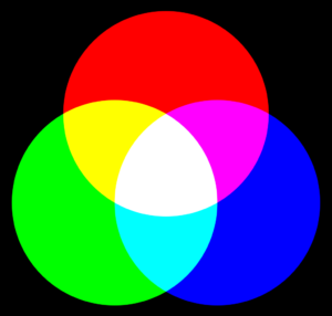
The RGB mode is used mainly for display purposes. It refers to a combination of lights from multiple coloured sources to achieve a specific colour. The three basic colours are Red (R), Green (G) and Blue (B), hence the acronym RGB. This is the mode used by LED/LCD screens such as your mobile phone or computer screen.
Additive Colour Model
Without light, everything is black. This is the start of this process. The value of each basic colour can vary from 0 to 255. The higher the values, the more intense the colours will be and vie versa. The more colours you combine, the more you go to pale shades, unlike the CMYK mode.
RGB Examples
Colour values are always given in the order Red, Green, Blue.
- White is obtained with all values at their maximum (RGB 255, 255, 255)
- Deep black is obtained with all values at their minimum (RGB 0, 0, 0)
- Yellow is a combination of Red and Green
- Purple is a combination of Red and Blue
Which colour mode to use for printing?
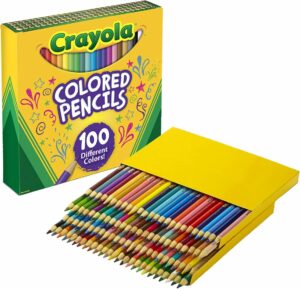
The available colour gamut varies greatly between the two modes. To better understand, imagine that the CMYK mode is the equivalent of a box of 64 coloured pencils and the RGB mode the equivalent of a box of 100.
The number of colours available is therefore greater if you work in RGB mode instead of CMYK. This means that certain subtleties or tones are not available or will disappear in CMYK mode.

Since modern printers use more colours than the original four CMYK, it is best to work in RGB mode. For example, here at Trim-Line, one of our printers uses a combination of CMYKLcLmLkOr inks: Cyan, Magenta, Yellow, Black, Light Cyan, Light Magenta, Light Black, Orange. This combination of inks helps to increase the colour gamut considerably, especially with orange and beige tones (skin tones included).
There is one exception however: when a printer wants to achieve accurate colour every time, they often use a CMYK recipe. Some company logos are also designed with specific CMYK values. It is possible to find an RGB equivalent, but the problem is that you have to do one or more tests for each printer and for each type of media used. It is therefore suggested to clearly indicate when a specific colour should be achieved. Often, a Pantone® Solid Coated chart is used to find the reference colour (also called PMS for Pantone® Matching System).
In summary, an image designed in RGB has more impact and vibrancy and is less flat than a CMYK image.
Can we simply convert a CMYK image to RGB?
Yes and no.
Yes it is doable: you can open the file in Photoshop for example and change the mode to RGB and save.
No in the sense that the conversion will not increase the rendering of the image or give it more punch. Back to the coloured pencils example, once the sketch is made with 64 coloured pencils, even if afterwards you are given a box of 100, the drawing still only uses the 64 colours.
In summary
Both modes are frequently used.
If you are looking for accurate colours every time without having to experiment too much and if you are not looking for a colour punch, the CMYK mode is appropriate.
In all other situations, RGB mode is preferable. And if you must combine vibrancy with precise colours, a few tests may be enough to ensure the client is happy with the result obtained. For these reasons, the vast majority of our files are in RGB format.


